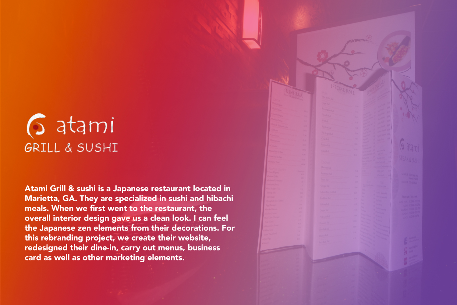
Atami Grill & Sushi
Rebranding for an Asian Restaurant in Marietta, GA
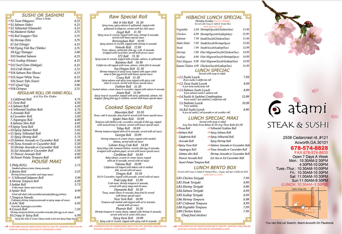
What Old Menu Looks Like
New Branding
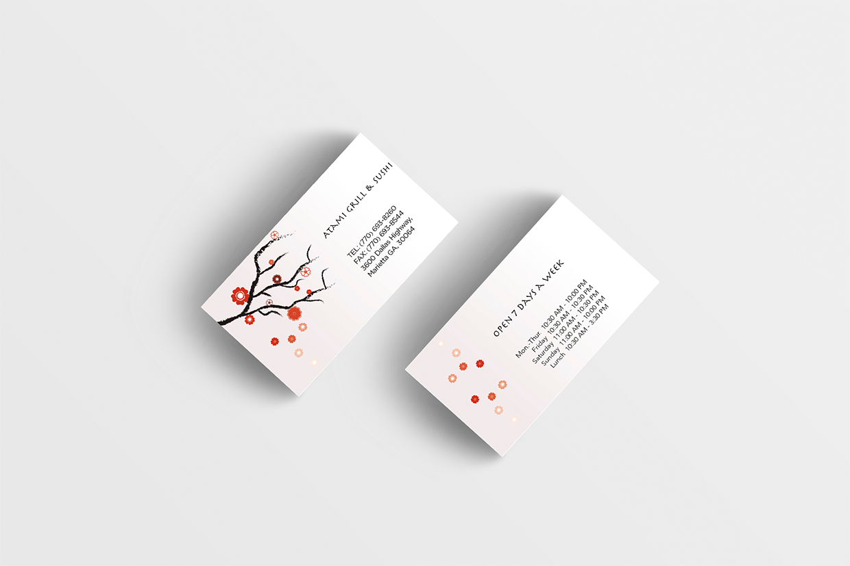
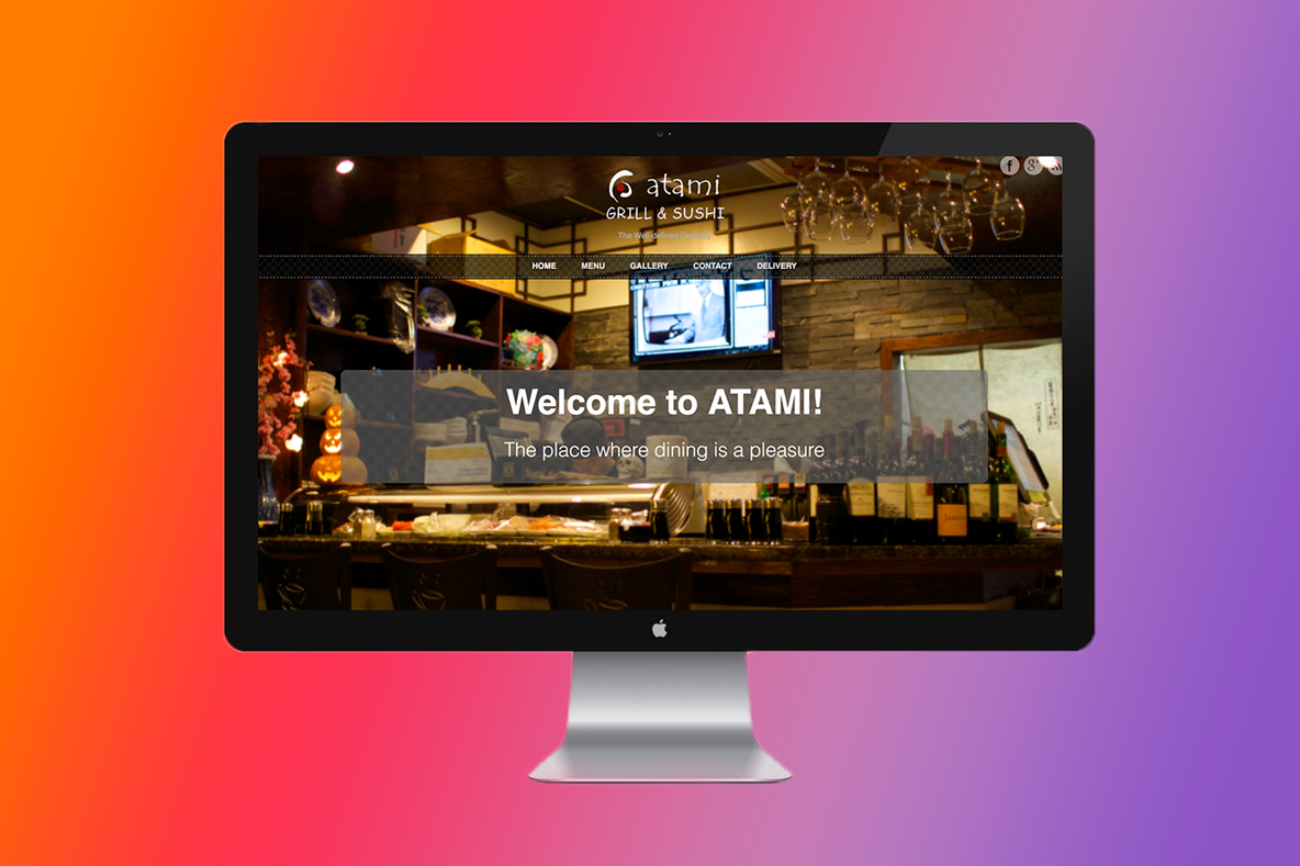
Menu, Business Card and Website
We took a look at their existing design and package, and then realized several problems they have with their marketing elements such as inconsistency of their product logo, spelling errors, unaligned design layout etc. We noticed their brand story such as using cherry blossom to illustrate Japanese cultural element. When we redid their branding, we were considering to keep the good part of their design but at the same time eliminating the unprofessional side of it.
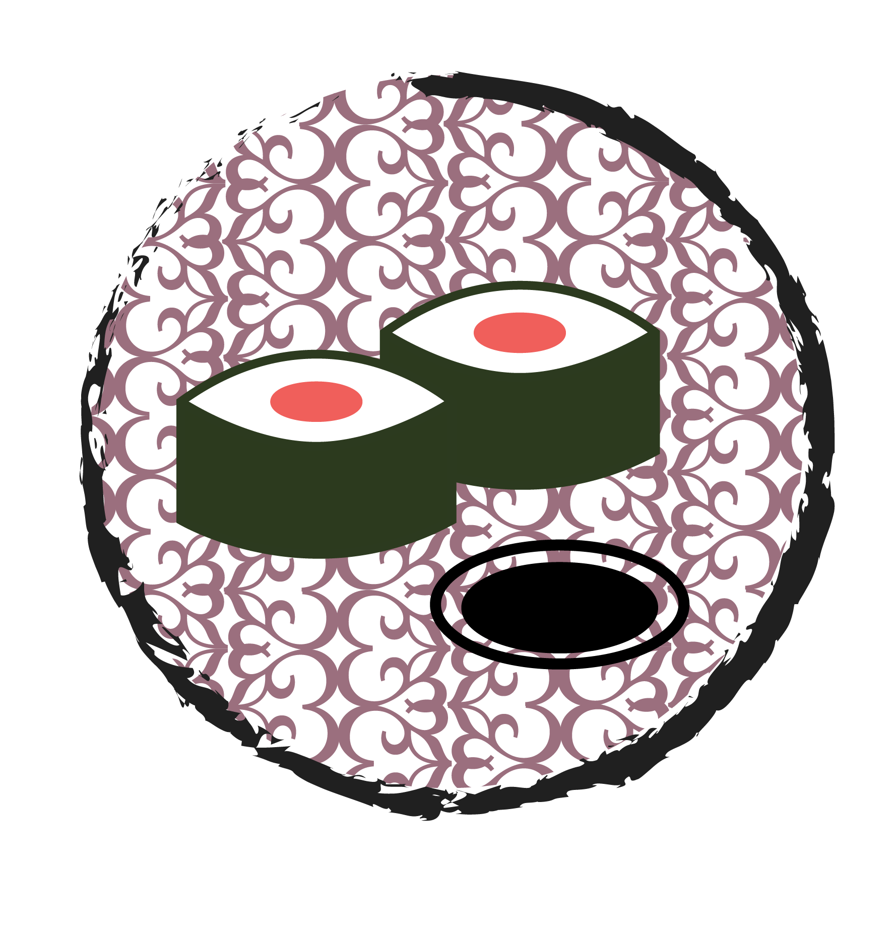
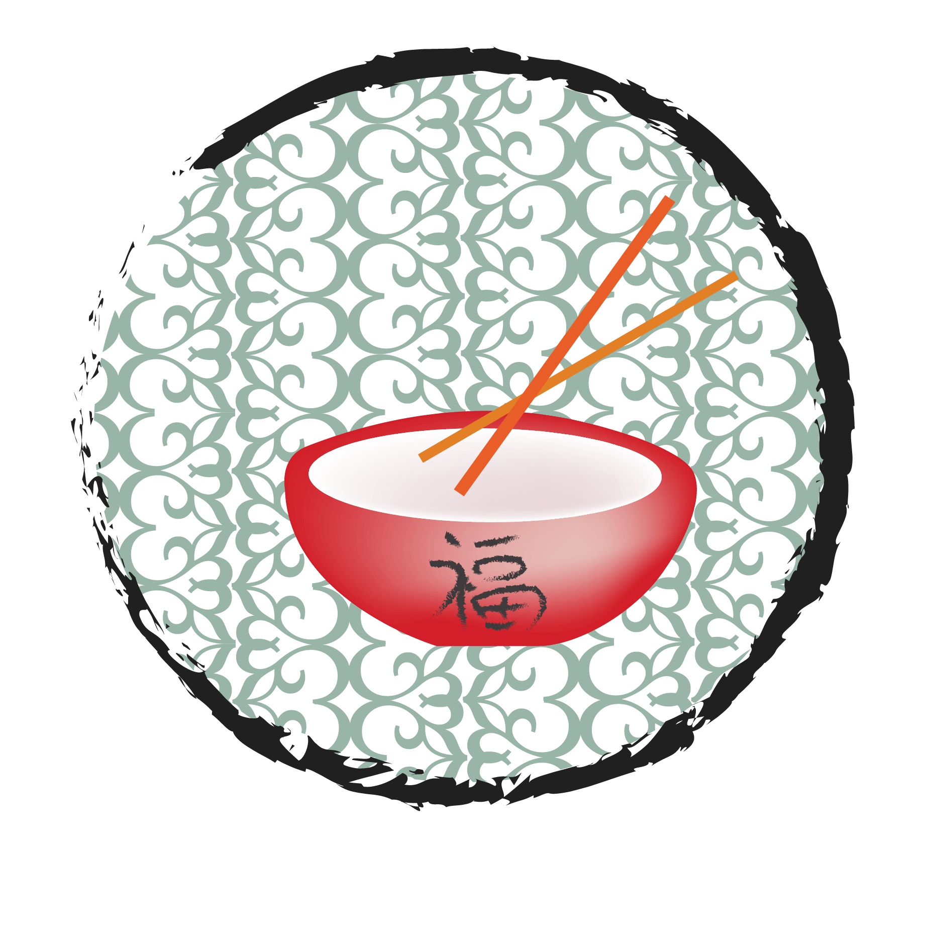
New Icons
We would like to use their cherry blossom graphic element. At the same time, we designed the new icons for them. These new icons appear in each different section on their dine-in menu and carry out menu.